

YEAR:
2021-2022
TIME FRAME:
10 weeks
CLASS:
COGS 187B: Practicum in Pro Web Design
WHAT I DID:
User Research, Prototyping, Branding, User Testing, UI Design
TOOLS USED:
Figma, Creative Cloud, Google Docs, Slides, Sheets
SIZE OF GROUP:
5 people
The current representation of the T4 Milpitas website doesn't convey the brand identity the client wants and the website doesn't easily allow for finding new or favorite items.
Create a new website prototype that properly conveys T4 Milpitas as a refreshing boba restaurant while also making it more useful for new and existing customers to order drinks and snacks.
Over the course of 10 weeks, we first had to find a local business that wanted to revamp their website. We then had to conduct research on their current customers, competing businesses and create a competitive analysis and personas based on those. We then did multiple rounds of user testing all the while keeping in contact with our client.
One thing that was tough was working around the business' busy schedules in order to get feedback and assets for the redesign. We also had to make sure everything was okay with the company before we progressed at certain times which proved difficult.
Also due to the fact that this project was conducted in a classroom setting, we were constrained by certain deadlines throughout the 10 week span. We also had to create both mobile and desktop versions of the website but mainly focused on mobile first and then translated to desktop.
.png)
We’ve all had the experience of being new to a restaurant and not knowing the best things to order. You either have to look up online the best things to get from there or ask friends for their recommendations and it can be a hassle. This was one of the many problems our group tried to tackle in the redesign of T4 Milpitas website.
T4 Milpitas is a boba tea shop located in San Francisco that prides itself on their wide variety of drinks and snacks. T4 also provides a cool spot to either relax with friends after school or take a break during work lunch break. But we found out that a lot of these users wanted a faster way to either find new items or order their favorite ones. Another problem was that they had two websites: one that was for ordering food and one that was used to show their brand.
.png)
.png)
How might we redesign the T4 Milpitas website to allow frequent customers to efficiently order and help newcomers explore the site while also staying true to the company brand?
How might we redesign the T4 Milpitas website to allow frequent customers to efficiently order and help newcomers explore the site while also staying true to the company brand?
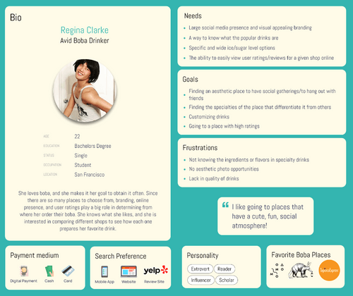
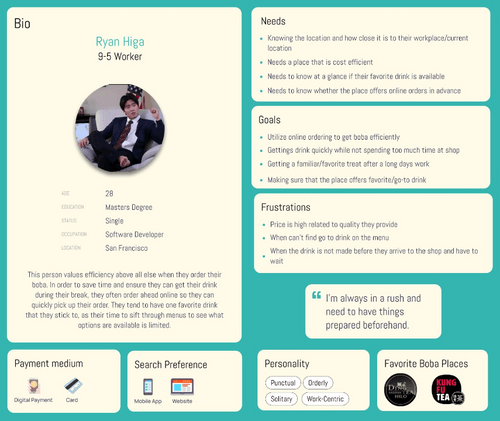
The first thing that our group did was try to understand the users that T4 Milpitas was targeting with their service. Based on demographics given to us from the company owner, we got a pretty good idea of the 3 main types of users that entered the shop: Avid Boba Drinkers, 9-5 Workers and Family-Oriented Parents.
In order to understand the needs of the main demographics, we conducted a total of 10 interviews (3 for Avid and Family and 4 for 9-5) and tried to see what every user group needed from a boba website and how the current T4 Milpitas website catered to those needs. Below are the results of those interviews:
The avid boba drinkers cared most about how brands presented themselves and wanted to see what specialties they had that separated one boba shop from the next. On T4 Milpitas' page, the lack of a dedicated section showing those off was were major drawbacks to the current website. They also mentioned that the current website didn't wow them visually.
For the 9-5 workers, what they cared about most was efficiency of ordering. Many are in a rush and wanted a method to get their go-to drinks as quickly as possible. The current implementation of the website requires the user to have to search categories in order to find a drink they order.
There are lots of overlapping needs for the family oriented parent with the 9-5 worker. For this category of user, they already know what their family members want and want to get things as quickly as possible. But some also mentioned that experimentation was big but as it stands, the current website doesn't cater to new boba drinkers.
The avid boba drinkers cared most about how brands presented themselves and wanted to see what specialties they had that separated one boba shop from the next. On T4 Milpitas' page, the lack of a dedicated section showing those off was were major drawbacks to the current website. They also mentioned that the current website didn't wow them visually.
There are lots of overlapping needs for the family oriented parent with the 9-5 worker. For this category of user, they already know what their family members want and want to get things as quickly as possible. But some also mentioned that experimentation was big but as it stands, the current website doesn't cater to new boba drinkers.
For the 9-5 workers, what they cared about most was efficiency of ordering. Many are in a rush and wanted a method to get their go-to drinks as quickly as possible. The current implementation of the website requires the user to have to search categories in order to find a drink they order.
The avid boba drinkers cared most about how brands presented themselves and wanted to see what specialties they had that separated one boba shop from the next. On T4 Milpitas' page, the lack of a dedicated section showing those off was were major drawbacks to the current website. They also mentioned that the current website didn't wow them visually.
For the 9-5 workers, what they cared about most was efficiency of ordering. Many are in a rush and wanted a method to get their go-to drinks as quickly as possible. The current implementation of the website requires the user to have to search categories in order to find a drink they order.
There are lots of overlapping needs for the family oriented parent with the 9-5 worker. For this category of user, they already know what their family members want and want to get things as quickly as possible. But some also mentioned that experimentation was big but as it stands, the current website doesn't cater to new boba drinkers.
The next thing we did was we created user personas based on those interviews. The first persona is the avid boba drinker that finds boba shops through the internet and focuses on branding first and the specialties of the place. The next customer that our client mentioned were 9-5 workers that care about ordering efficiency and making sure that a place has their go-to drink. The third group were the family-oriented parents that orders for all their kids and tries to explore for new flavors.
The next thing we did was we created user personas based on those interviews, we created personas. The first persona is the avid boba drinker that finds boba shops through the internet and focuses on branding first and specialties of the places. The next customer that our client mentioned were 9-5 workers that were situated near a busy business district. The third group was the family-oriented parents that orders for all their kids and tries to explore for new flavors.

.png)
In order to understand the needs of the main demographics, we conducted a total of 10 interviews(3 for Avid and Family and 4 for 9-5) and tried to see what every user group needed from a boba website and how the current T4 Milpitas website catered to those needs.
The avid boba drinkers cared most about how brands presented themselves and wanted to see what specialties they had that separated one boba shop from the next. On T4 Milpitas' page, the lack of a dedicated section showing those off was were major drawbacks to the current website. They also mentioned that the current website didn't wow them visually.
For the 9-5 workers, what they cared about most was efficiency of ordering. Many are in a rush and wanted a method to get their go-to drinks as quickly as possible. The current implementation of the website requires the user to have to search categories in order to find a drink they order.
There are lots of overlapping needs for the family oriented parent with the 9-5 worker. For this category of user, they already know what their family members want and want to get things as quickly as possible. But some also mentioned that experimentation was big but as it stands, the current website doesn't cater to new boba drinkers.
Another thing we did was we gathered information on how other brands displayed themselves as well as we looked at features that we might want to utilize in our revamped website for T4 Milpitas. The four companies below were the main competitors that we chose due to them being brands that we and the company CEO liked:

.png)
.png)
.png)
Then based on that research we found that these were the things that we wanted to implement into the redesign:
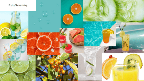
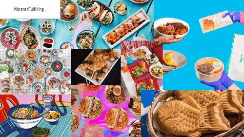
We then created 3 separate moodboards that would represent T4 Milpitas' brand. We came up with Fruity/Refreshing, Spring/Relaxing, and Vibrant/Fulfilling. We then presented all the moodboards to our client and she thought that Fruity/Refreshing represented T4 Milpitas the most. We would then utilize these findings in our color scheme choice later on.
Another thing we did was we gathered information on how other brands displayed themselves as well as we looked at features that we might want to utilize in our revamped website for T4 Milpitas. The four companies below were the main competitors that we chose due to them being brands that we and the company CEO liked:
.png)
.png)
.png)
.png)
Some Key Findings that We Wanted to Use in Our Redesign Included:
Then based on how other companies branded themselves, we created 3 separate moodboards that would represent T4 Milpitas' brand. We came up with Fruity/Refreshing, Spring/Relaxing, and Vibrant/Fulfilling. We then presented all the moodboards to our client and she thought that Fruity/Refreshing represented T4 Milpitas the most. We would then utilize these findings in our color scheme choice later on.

.png)
.png)
When going into our lo-fi prototype, there were 4 main things that we wanted to improve upon in our redesign:
1. How do we make a way of ordering that is more efficient for users?
-Add a favoriting system
2. How do we showcase specialty items to users?
-Create a landing page that has an image carousel for specialty items
3. How do we help those users that want to experiment and find new drinks and food?
-Implement a commenting system for users to recommend certain items
4. How can we help establish T4's brand throughout the website?
-Add embedded social media links on the homepage and show employee/company pictures throughout
.png)
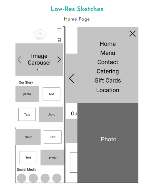
In order to test the lo-fi prototype we made, we ran a user test in order to see what to change before we went to the hi-fi prototype.
One thing our user mentioned was due to the size of T4's menu, there should be a way for the user to better navigate the menu while they are already scrolling down the menu. We iterated on this by adding a "back-to-top" button that would allow the user to go back to the filters at the top.
The user also said that they would like more options on the menu filter since we only had three placeholder ones in the lo-fi prototype.
We also ran our prototype across the client as well and talked with her about the feedback. She overall agreed with all the criticism and gave us her concerns about the commenting feature. She thought that commenting would be ripe for spamming and would be hard to moderate on top of running the business. So we brainstormed with her what could replace this feature and we came up with an employee testimonial section. This would not only make it so users could get a gist of general sentiments surrounding a drink while also being easier to monitor.
When creating the hi-fi prototype, we had to make sure to adhere to the style guide as well as implement the changes asked by the users in the lo-fi feedback.
There were lots of hurdles to jump when creating a functional hi-fi prototype. One of the main hurdles was finding assets in order to use for the website. We had to both wait on our client to provide pictures as well as scrape pictures from their Instagram and website. Another laborious task was creating all the overlays for menus items as well as making sure all the interactions worked as intended. The following was our first attempt of a hi-fi prototype:
.png)
When user testing, our users liked the idea of having a favoriting system but thought that the heart we had initially wasn't super clear so we changed it to a star.
Users also wanted us to fix opacity issues on the overlay descriptions but thought that their inclusion was super useful and would help for those items that you weren't sure about.
Users also had some feedback on overall visual consistency throughout the website so we took time to really make everything the same across screens.
Our client liked the direction we were heading as well and was afraid of how a commenting system could be ripe for spam and as a compromise we utilize employee testimonials instead.
In order to test the hi-fi prototype we made, we some user tests in order to make the necessary adjustments to our final hi-fi design.
The main area of criticism that we got in our initial hi-fi prototype was a lack of consistency throughout the screens. This could have stemmed from each of us working on different screens and not following the style guide to a tee.
In order to fix this, we met as a group and reflected on what we wanted each of the elements to look like, including headers, font size, border radius, etc. while also holding group members accountable.
We also got criticism to change the favoriting button from a heart to a star because users thought that hearting would have a similar feature to liking a post on Instagram and were confused.
Another user mentioned that we should include the social media links when users open up the hamburger menu in order to allow for faster options to get to their social media.
The last criticism we had was when looking for location and hours, they expected it to be in the footer so we also revamped the footer to allow for that information to be there.
.png)

This project was one of the longest projects I've ever undertaken and the aspects that I feel helped contribute to the success of this project was not only how much we communicated with our client but also how well all 4 of us worked together as a team. If we had more time, the next steps would be to run further user tests to see how the finished high fidelity prototypes fair. Then after that, we would try to translate this Figma project into a fully functional website.
We then did one final run of user testing with our high fidelity prototype in order to test the viability of the design. All users mentioned how intuitive it was to favorite and have access to drinks they wanted later on. User's also liked the overall aesthetic of the site and thought that it was simplistic yet sleek while also being colorful. Another aspect that users thought was novel was including the employee testimonials section in order to get an idea of what a drink was all about.
But there were still things we could improve upon. One thing they mentioned was that they would add was a search feature within the menu in order to have even more options when finding a specific drink. Users also mentioned that we could improve the topping ordering process by having sections of topping types rather than just listing them out in bullet point style. The last critique was that there should be some sort of confirmation screen on the gift card section and we thought that it was a a small enough change that we chose to just implement that into the prototype but we didn't have time for the other changes.
In conclusion, this was a very long project was deemed a success by our team and our client. When we presented our client, she was thrilled with our redesign and thought that it not only stuck to the T4 brand but also helped improve the website as a whole. There were many challenges along the way such as managing all the interactions on the site, creating both a mobile and desktop version as well as keeping up with due dates and creating a final product that everyone was happy with.
The next steps for this project would be to implement the critiques from that final round of user testing. Then we would also have to implement all interactions such as ordering and favoriting for each item because for usability testing sake, we were only able to do it with one item. Then the final thing to do would be to actually try an implement the site into a fully functional version with the help of our prototype as a backbone and do user tests with that. But all in all, the project came out great and is something that I'm very proud of.